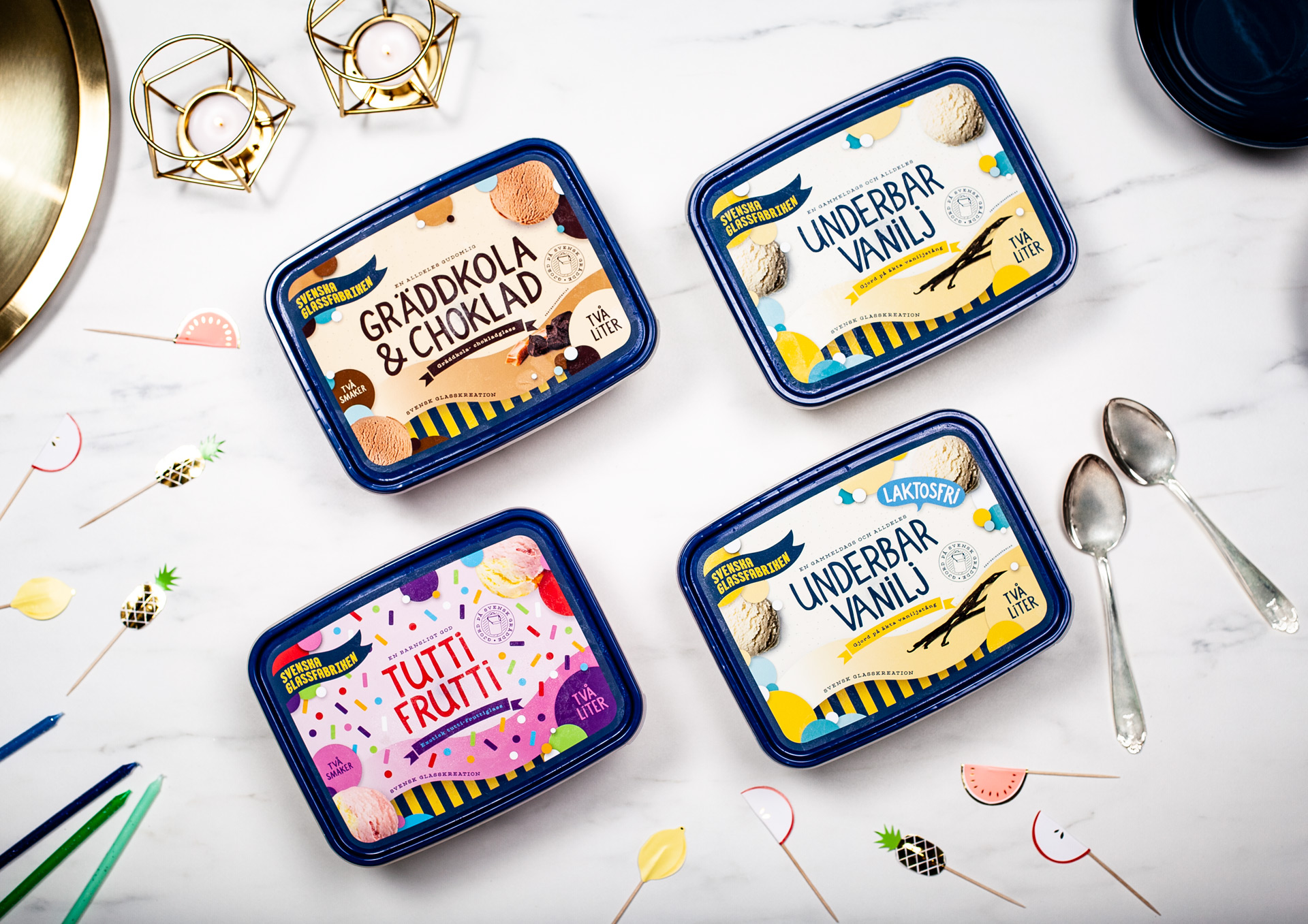
Svenska Glassfabriken
Who doesn't like ice cream? It puts a smile on your face on a blue monday, so there is always room for some ice cream.
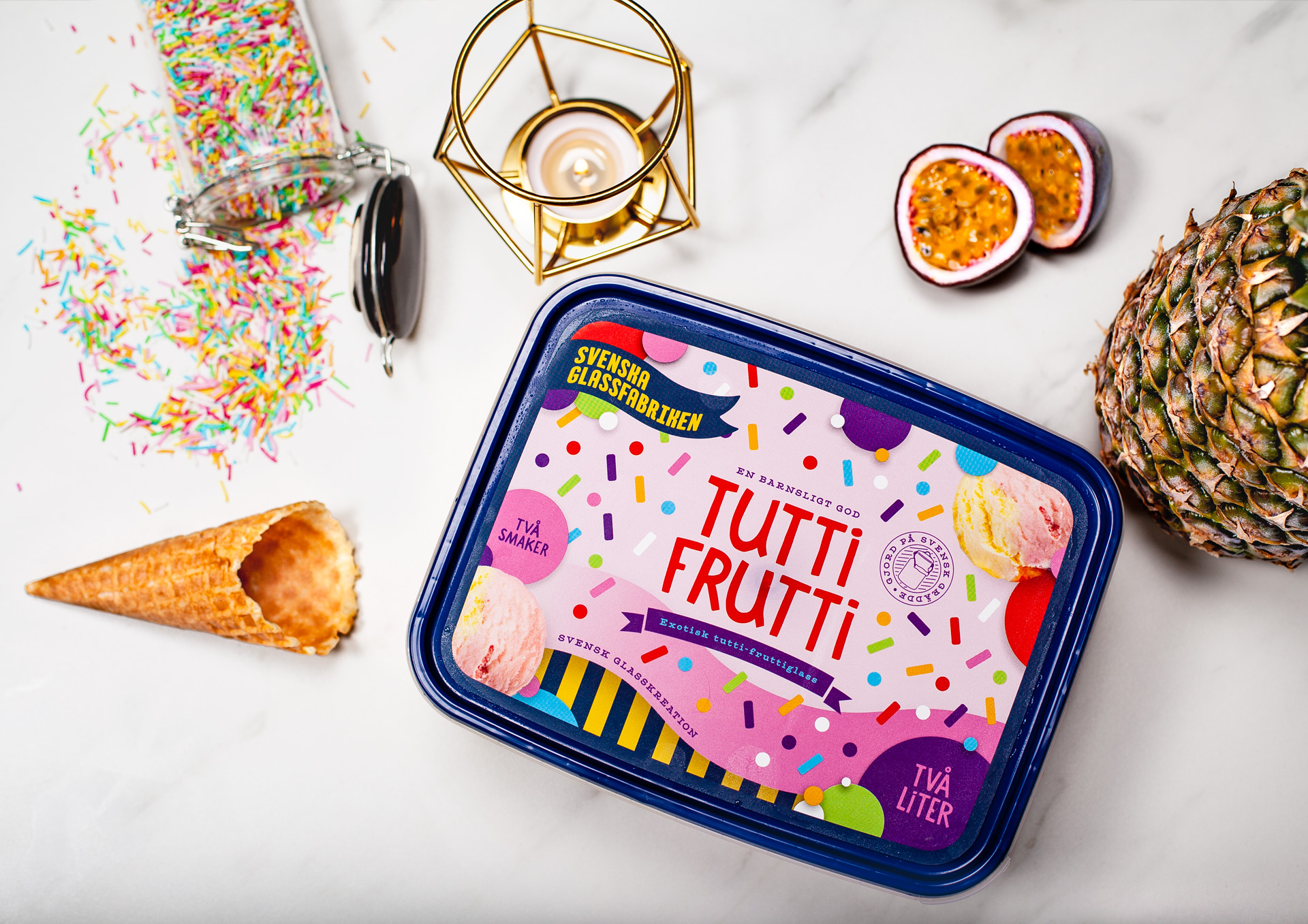
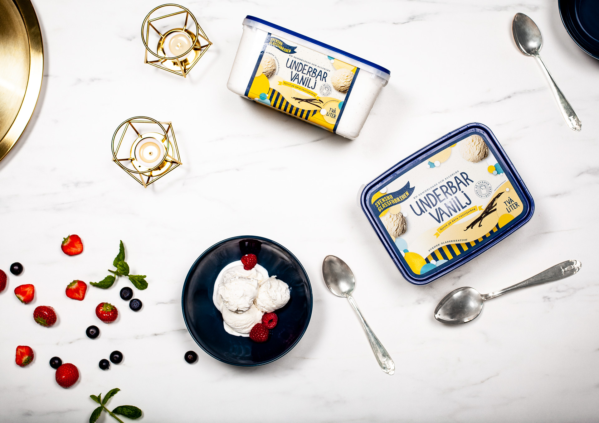
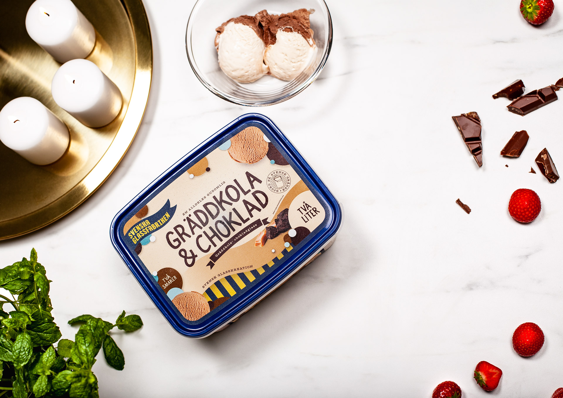
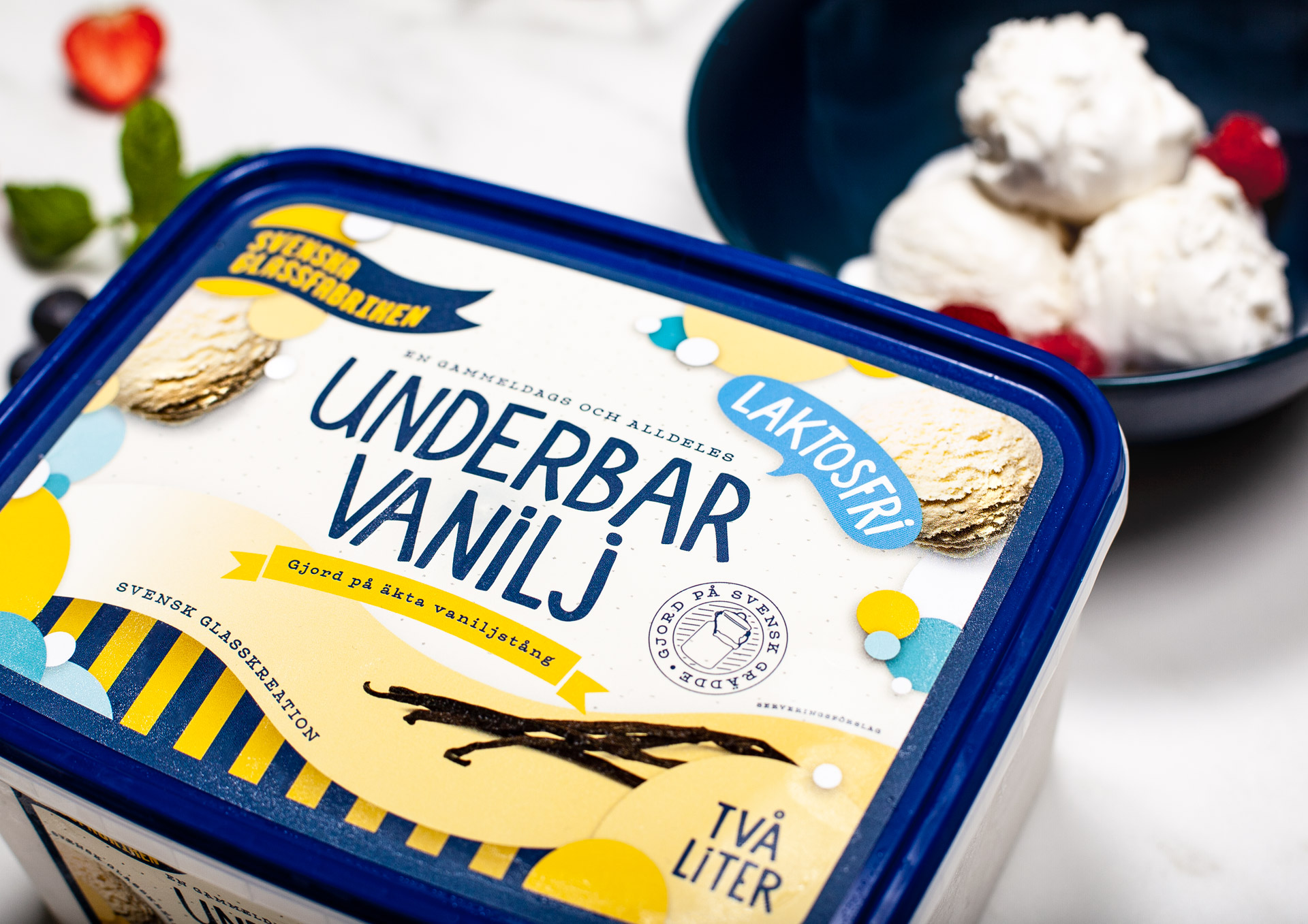
When the new brand, Svenska Glassfabriken (Swedish Ice cream Factory) was launched, the packaging was created to bring your mind to those hot summer days.
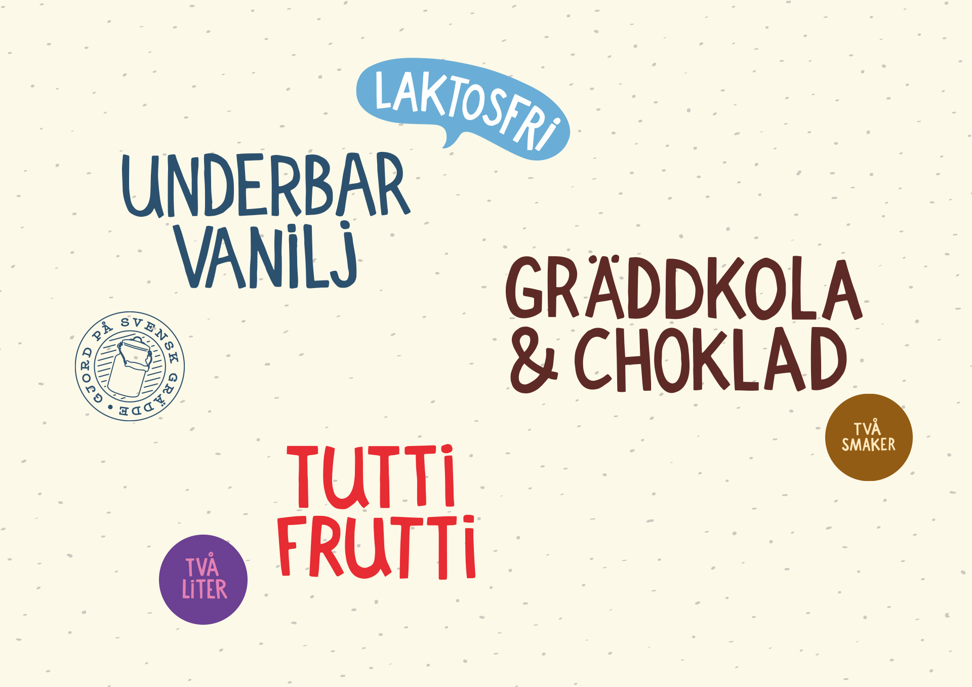
All the typography was hand drawn to reflect the craftmanship that goes into making ice cream. Tasty right?
Case
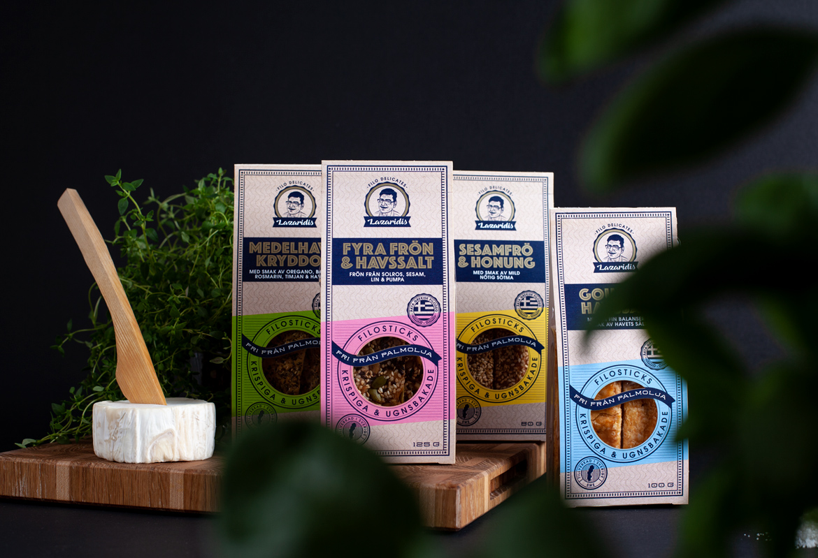
Filosticks - LazaridisPackaging
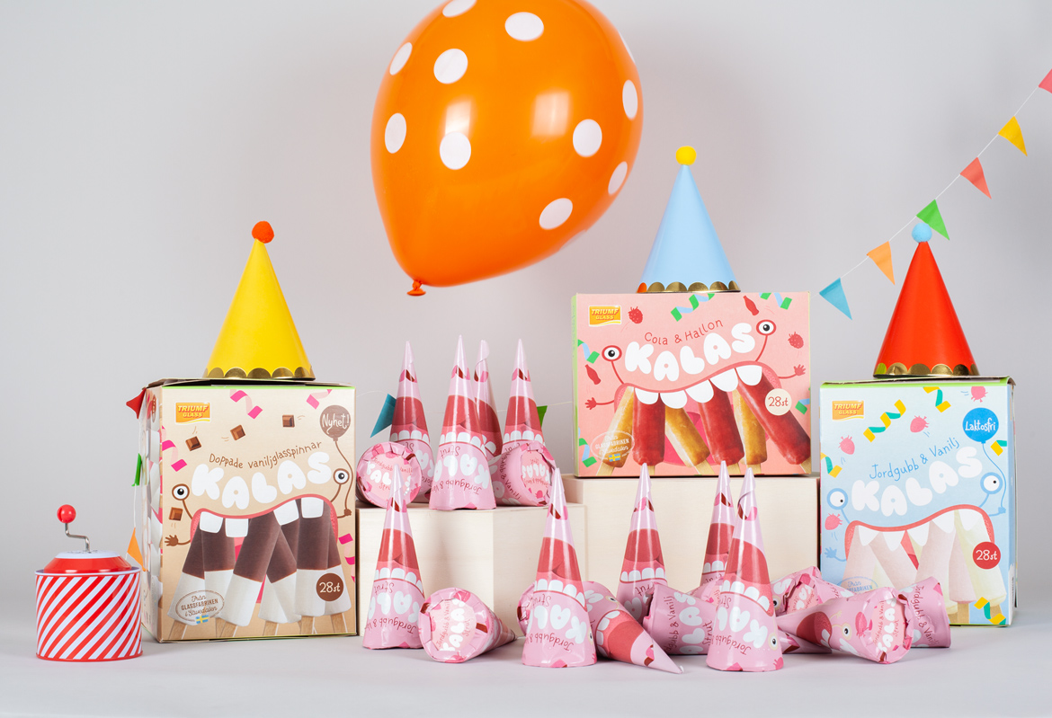
Kalas - Triumf GlassPackaging
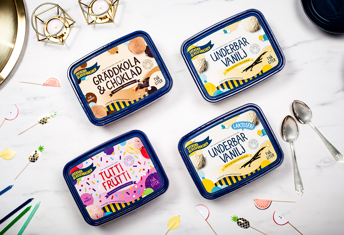
Svenska GlassfabrikenPackaging
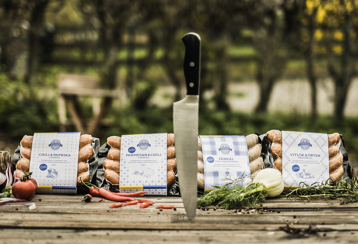
Svenska GårdarRebranding & packaging
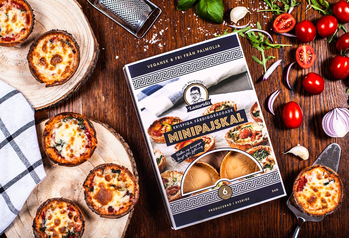
Filodelicates - LazaridisPackaging
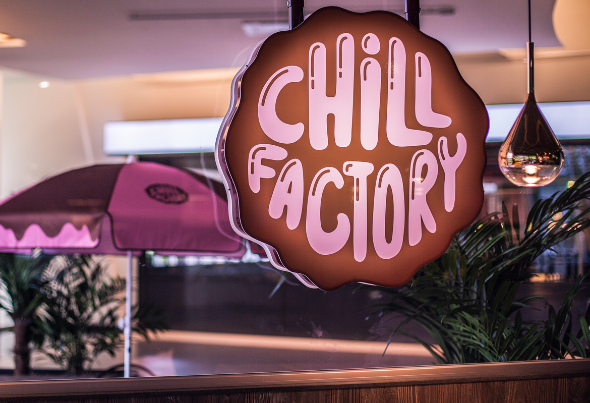
Chill FactoryBranding & illustration
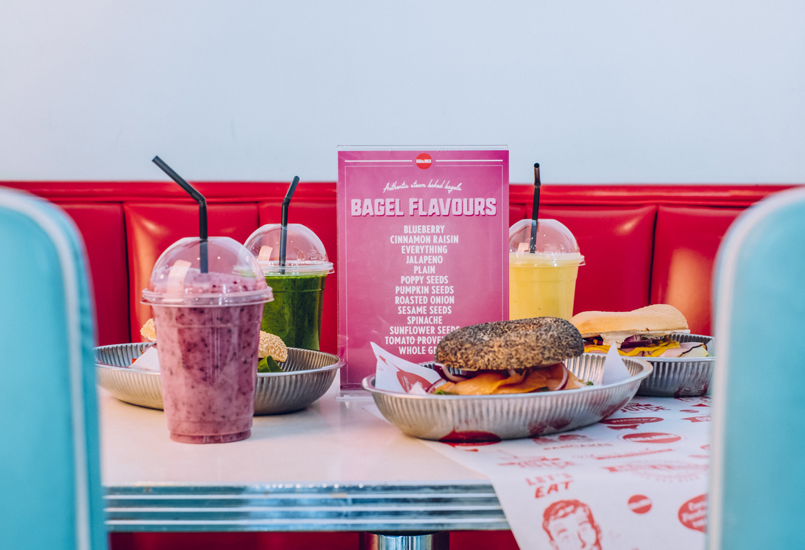
Egg & MilkBranding & illustration
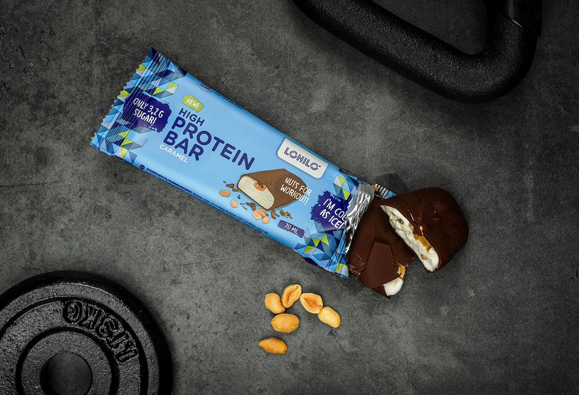
LohiloPackaging
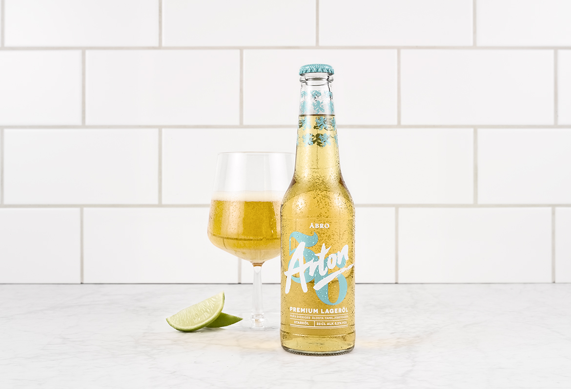
Åbro Arton 56Packaging
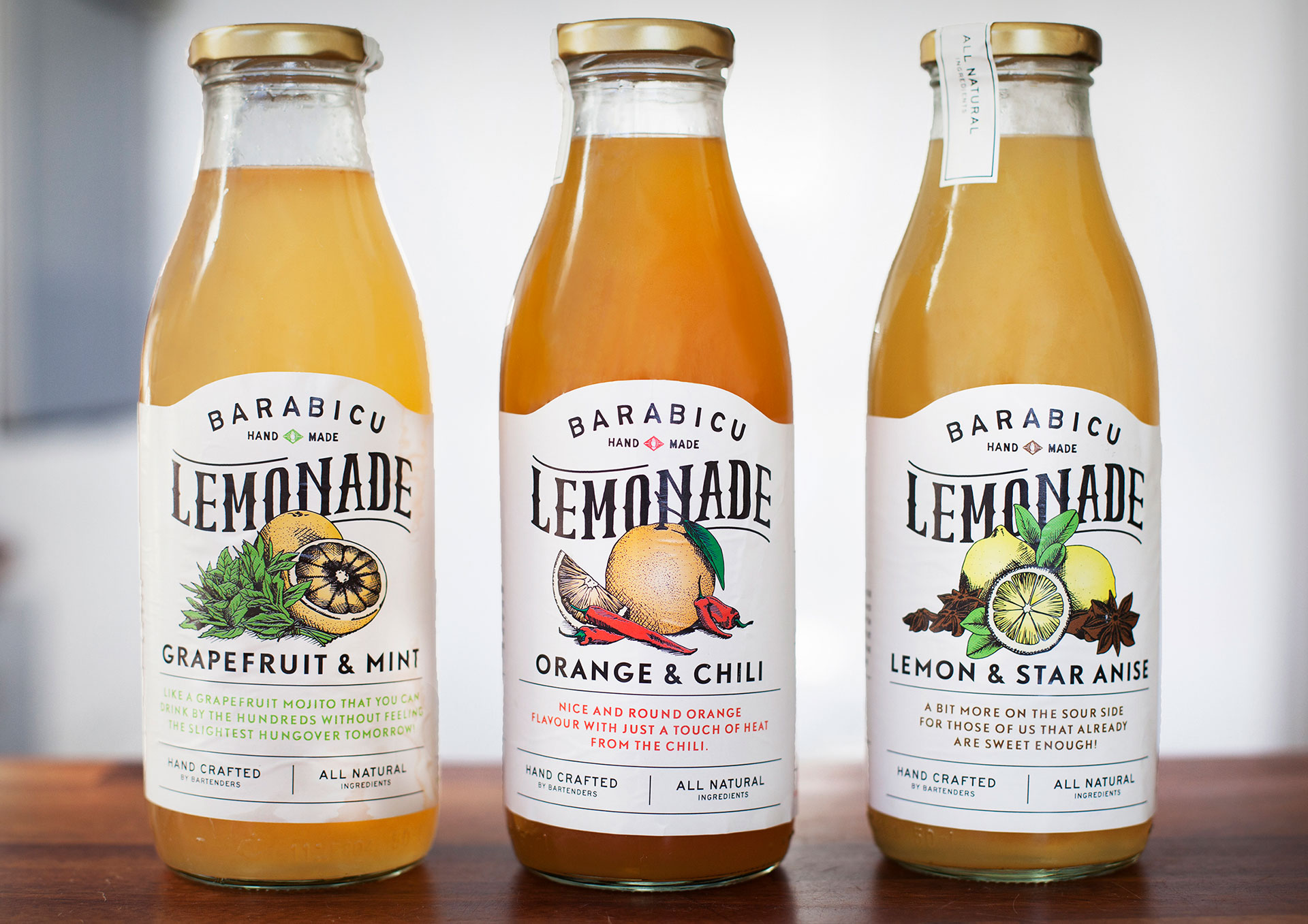
Barabicu - LemonadeIllustration & typography
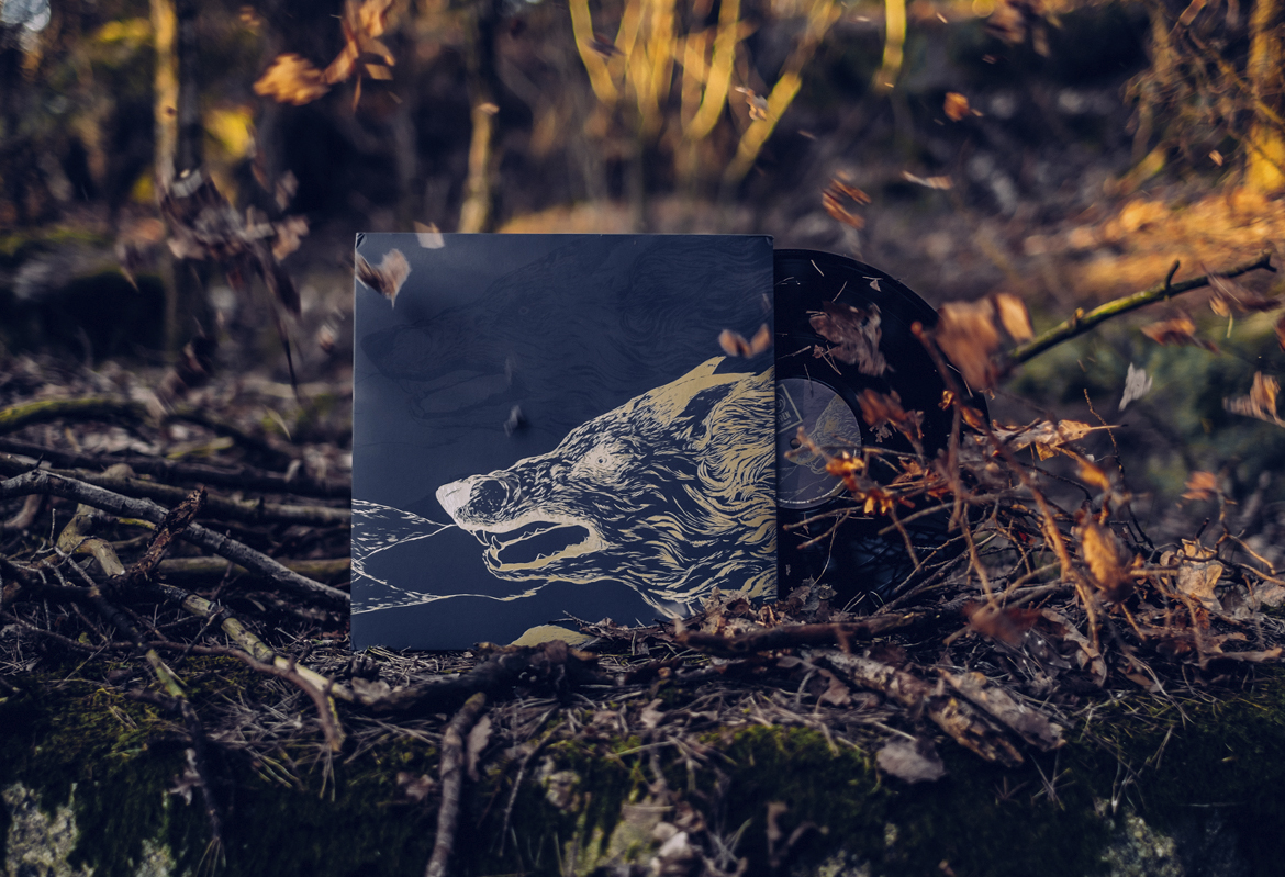
SOENAlbum cover
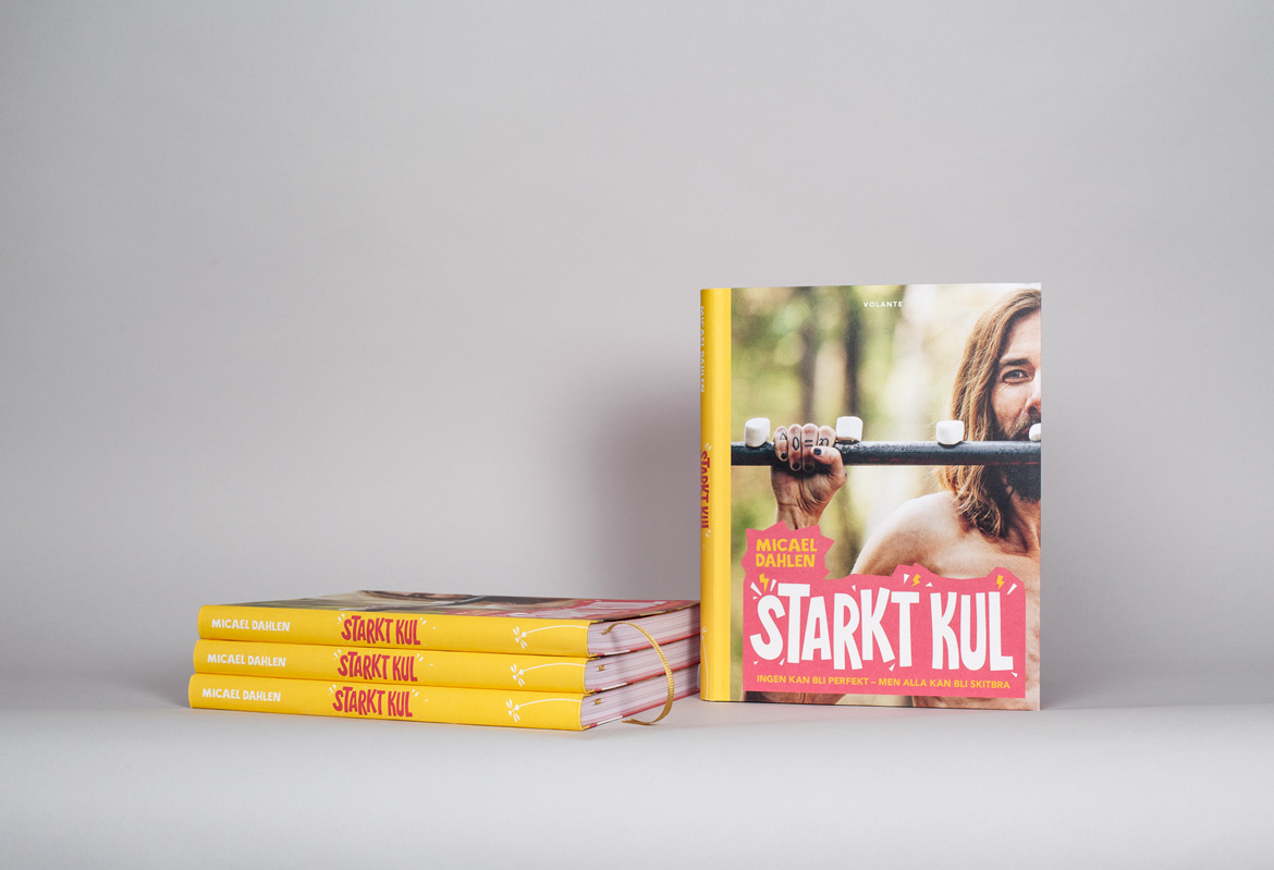
Starkt Kul - Micael DahlenBook Design

STUBOGraphic profile
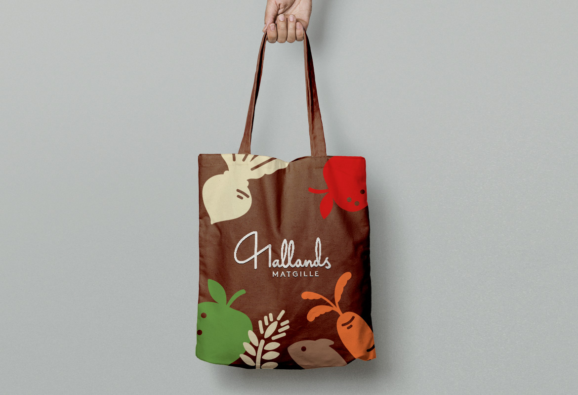
Hallands MatgilleGraphic profile
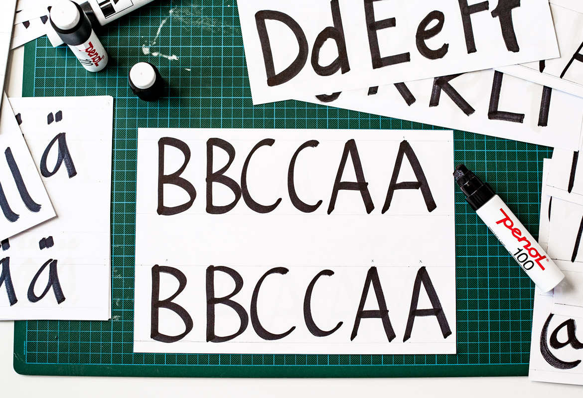
NetOnNet - TypefaceTypeface
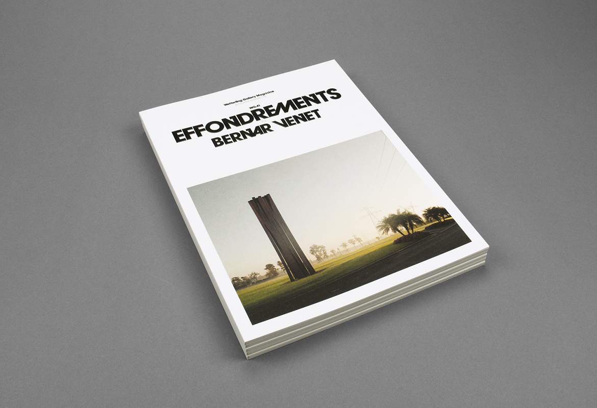
Wetterling GalleryExhibition catalogues